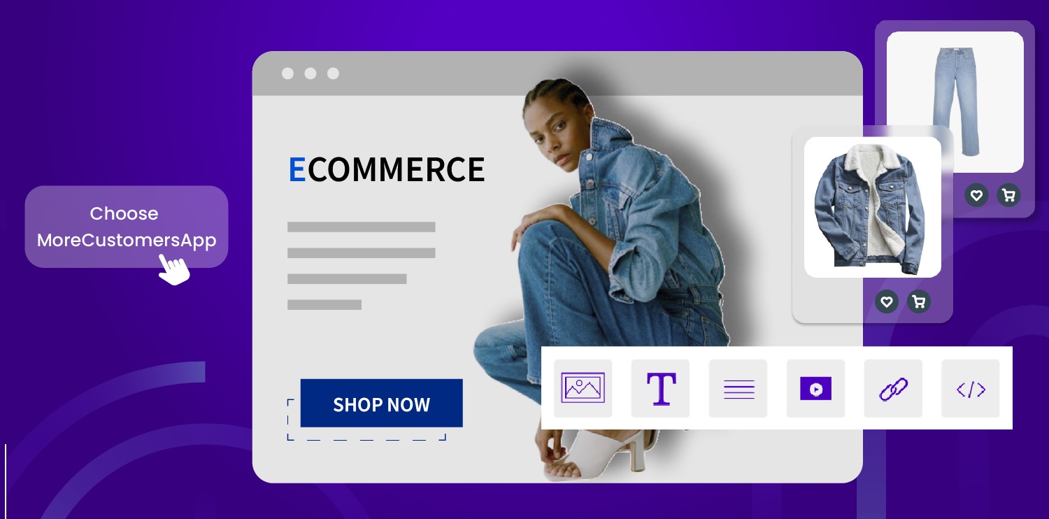
How to Design your Online Store with MoreCustomersAp
Ecommerce website design is crucial for online businesses as it directly impacts user experience, brand perception, trust, conversions, mobile accessibility, and search engine visibility. By investing in a well-designed website, you can create a positive impression, attract customers, and drive the success of your online business. A well-designed ecommerce website enhances the user experience and makes it easy for visitors to navigate, search for products, and complete their purchases. Intuitive navigation, clear product categorization, prominent search functionality, and streamlined checkout processes contribute to a positive user experience, increasing the likelihood of conversions and customer satisfaction.
Your online store design is an opportunity to showcase your brand identity and differentiate yourself from competitors. A visually appealing and cohesive design that aligns with your brand values and aesthetics helps build brand recognition and trust. Consistent branding across your website fosters familiarity and enhances the overall perception of your online business.
A professional and well-designed ecommerce website instills trust and credibility in your online business. Users are more likely to trust and make purchases from a website that looks trustworthy, secure, and reliable. Implementing trust signals such as secure payment options, customer reviews and testimonials, SSL certificates, and clear contact information can further enhance trustworthiness.
Having a responsive website design is essential. A responsive design ensures that your ecommerce website adapts to different screen sizes and provides a seamless experience across desktops, tablets, and smartphones. By catering to mobile users, you expand your reach and maximize the chances of converting mobile visitors into customers.
Effective ecommerce website design incorporates various conversion optimization techniques. This includes strategic placement of call-to-action buttons, persuasive product descriptions, high-quality product images, customer reviews, and a well-structured checkout process. By optimizing your website design for conversions, you can increase the likelihood of turning visitors into paying customers. A search engine-friendly design ensures that your website is easily crawlable by search engines, loads quickly, and provides a good user experience. Properly structured URLs, meta tags, headings, and relevant content contribute to better search engine rankings, increasing the visibility of your online business and driving organic traffic.
How MoreCustomersApp create beautiful Shopping websites?
MCA has an inbuilt editor, that help it’s user easily change theme of it’s website. Now no need of hiring graphical designer or out sourcing your website design work. MCA has made it so simple to use that even a non-technical person can change his online store’s design in few clicks. MCA Editor works on Modular Building blocks.
MCA’s Modular building blocks are designed for flexibility and customization in online store design. They involve breaking down the design elements of an online store into smaller, reusable components or modules that can be easily rearranged and combined to create different layouts and configurations.
Here are some common modular building blocks used in MoreCustomersApp online store design:
1. Header
In online store design, a header is a key building block that plays an important role in the overall user experience. It is typically positioned at the top of the webpage and serves as a navigation and branding element. The header provides essential information and functionalities for users to explore and interact with the online store.
Here are some common components of a header in an online store:
Logo: The logo represents the brand and is usually placed at the top-left corner of the header. It helps users quickly identify and associate the online store with the brand.
Main Navigation: The main navigation menu includes primary categories or sections of the online store. It enables users to browse different product categories or access important pages, such as the home page, product pages, shopping cart, and account sections.
Search Bar: A search bar allows users to search for specific products, brands, or keywords within the online store. It facilitates easy and quick navigation, especially for users with specific needs or preferences.
Shopping Cart/Bag Icon: The shopping cart or bag icon indicates the number of items in a user’s cart and provides a link to the shopping cart page. It enables users to review their selected items, proceed to checkout, or manage their shopping cart.
Account/Login Area: This area provides options for users to log in or create an account. It may also include features such as order tracking, wish lists, or personalized recommendations for logged-in users.
Contact Information: The header may include contact details such as a phone number, email address, or live chat option to facilitate customer support and assistance.
Promotional Banners/Links: Online stores often utilize the header space to highlight ongoing sales, promotions, or featured products. This can be done through banners, sliders, or text links that draw attention to specific offers.
Secondary Navigation/Utility Links: Additional links for user convenience may be included in the header, such as About Us, FAQ, Shipping and Returns, Contact Us, or Help sections. These links provide supplementary information and support for users.
Responsive Design: With the prevalence of mobile devices, it is crucial to ensure the header design is responsive and adapts to different screen sizes. This allows users on mobile devices to have a seamless experience accessing and navigating the online store.
The specific design and arrangement of these components can vary depending on the brand, website layout, and user experience goals. The goal is to create a visually appealing, user-friendly, and intuitive header that enhances the overall online shopping experience.
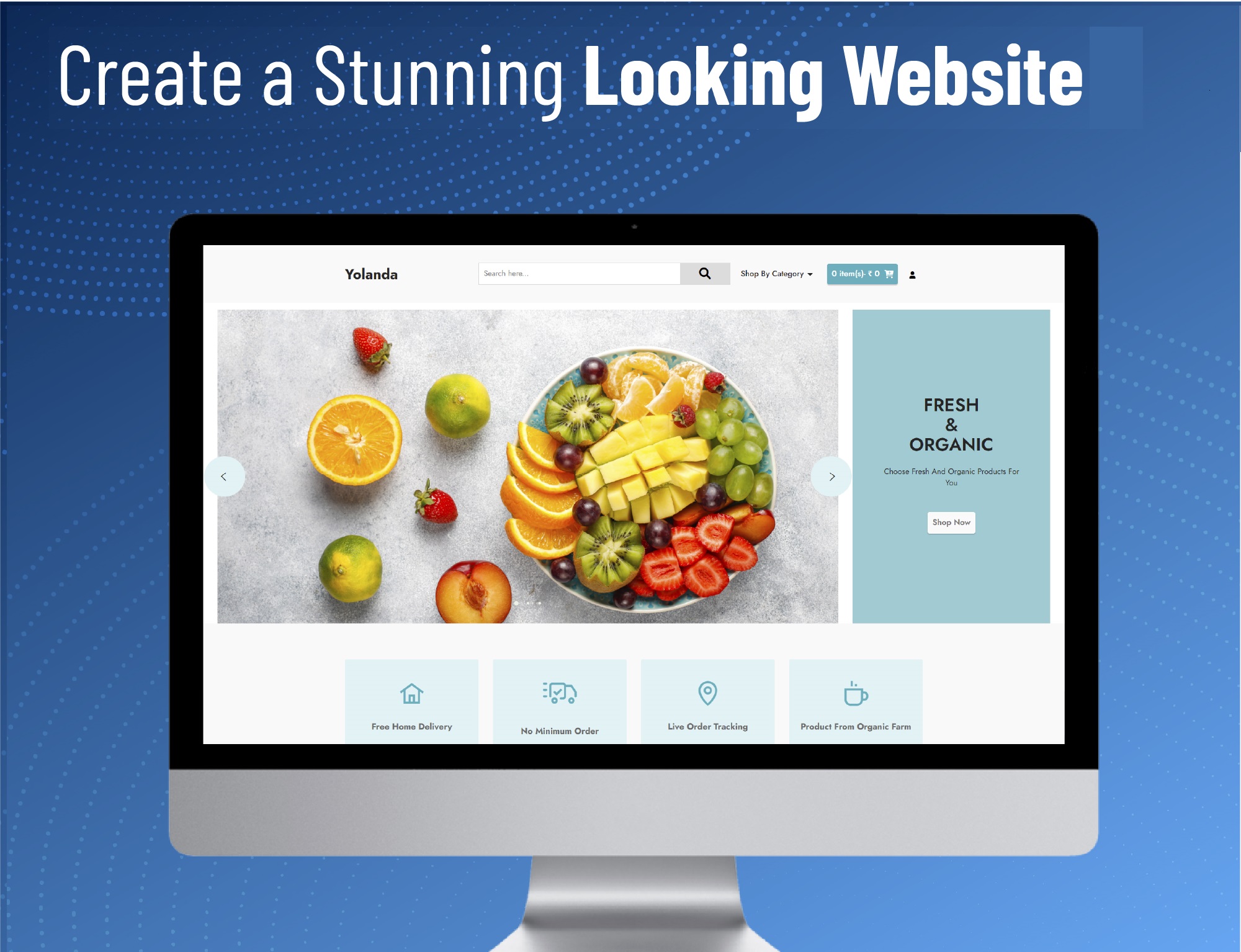
2. Image Display
This module is used to showcase featured products, promotions, or important announcements in a visually appealing manner. It often includes text, images, and call-to-action buttons. It is a visually engaging element that occupies a prominent position on your website, typically near the top of the homepage. MoreCustomersApp Editor has different Image Display blocks to place banners/sliders on webpage.
Here’s a breakdown of how to effectively design and implement a banner/slider building block:
Purpose and Content:
1. Determine the purpose of your banner/slider. Are you promoting a sale, highlighting new arrivals, or showcasing specific products or categories?
2. Keep the content concise and compelling. Use catchy headlines, high-quality images, and clear call-to-action buttons to engage visitors.
3. Ensure that the content is relevant and aligned with your overall marketing strategy.
Design and Layout:
1. Choose an appropriate size for your banner/slider that fits well with your website’s overall design. Consider responsive design to ensure it adapts to different screen sizes.
2. Opt for high-resolution images that are visually appealing and relevant to your message.
3. Maintain a consistent visual style that aligns with your brand, including fonts, colors, and graphics.
4. Incorporate a readable, attention-grabbing headline and supporting text, if necessary.
5. Use a clear and visually distinct call-to-action button to encourage user interaction.
Animation and Transitions:
1. If you opt for a slider format, use smooth and visually pleasing transition effects between slides. Avoid overly distracting or slow transitions.
2. Consider using subtle animation or movement within the banner/slider to attract attention and create a dynamic feel.
3. Ensure that the animation doesn’t detract from the overall user experience and doesn’t slow down the page loading time.
Placement and Visibility:
1. Position the banner/slider prominently on your homepage to maximize visibility. It’s often placed near the top of the page or just below the navigation menu.
2. Ensure the banner/slider doesn’t take up too much vertical space, allowing users to see other relevant content without excessive scrolling.
3. Consider incorporating navigation indicators or controls, such as arrows or dots, to allow users to manually navigate through the slides.
Testing and Optimization:
1. Regularly analyze the performance of your banner/slider building block using web analytics tools. Track metrics such as click-through rates, conversions, and user engagement.
2. A/B test different variations of the banner/slider, including different images, headlines, or call-to-action buttons, to identify the most effective design.
3. Continuously optimize the content and design based on user feedback and data to improve its effectiveness.
By carefully designing and implementing a banner/slider building block in your online store, you can effectively capture your visitors’ attention, promote your products or offers, and enhance the overall user experience on your website.
3. Product Display
MoreCustomersApp Editor provides different Display block to show your products. They can be in Grid form, Carasoul Layout, Or Individual Product display block. Whether you run Grocery business, books selling business or sell niche DIY items, every website has a different requirement of displaying their products on HomePage. MoreCustomersapp provide that flexibility of choosing according to your business and needs. Just Drag and Drop the block, add the link to fetch products, place a title and you are all set.
4. Product List
This module displays a grid of product thumbnails or cards on a webpage, allowing users to browse and select items. It can include filters, sorting options, and pagination for easy navigation through large product catalogs.The purpose of a product grid is to provide a visually appealing and organized layout that allows users to browse and locate products efficiently.
Each product in the grid is represented by a thumbnail image that gives users a visual preview of the item. Thumbnails should be high-quality, consistent in size, and optimized for fast loading. Product Information: Along with the thumbnail, essential information about the product should be displayed, such as the product name, price, and any available variations (e.g., size, color). This information can be placed below or overlaid on the thumbnail.
Sorting and Filtering: Provide sorting and filtering options to allow users to customize the product grid based on their preferences. Common sorting options include price, popularity, and customer ratings. Filtering options can include categories, brands, sizes, and more. You can either have this block on top of the product grid or on side bar.
Add to Cart/Buy Now Buttons: Each product listing should include clear and prominent buttons for users to add items to their cart or proceed directly to the checkout. These buttons should stand out visually and be easily accessible.
Hover Effects: Consider adding interactive hover effects to enhance the user experience. For example, when a user hovers over a product thumbnail, you can display additional information, such as a quick view, product ratings, or an “Add to Wishlist” button.
Responsiveness: Ensure that the product grid is responsive and adapts well to different screen sizes and devices. This allows users to have a consistent shopping experience, whether they’re using a desktop, tablet, or smartphone.
Remember to continuously test and iterate on your product grid design based on user feedback and analytics data. A well-designed and user-friendly product grid can significantly impact the overall shopping experience and contribute to higher conversion rates.
5. Footer
The footer appears at the bottom of every page and typically contains links to important pages, contact information, social media icons, and copyright notices.
Site Navigation: The footer often includes links to important pages within the online store, such as the homepage, product categories, about us, contact, FAQs, and customer service.
Contact Information: It is common to include contact details like phone number, email address, physical address, and links to social media profiles. This allows users to easily get in touch with the store if they have any questions or concerns.
Store Policies: Online stores typically provide links to important policies such as terms and conditions, privacy policy, shipping and return policies. This helps users understand the store’s rules and regulations before making a purchase.
Payment and Security Information: To instill trust and reassure customers, online stores may include logos or icons representing accepted payment methods (e.g., credit cards, PayPal), as well as security badges indicating that the website is secure for transactions.
Newsletter Signup: Many online stores encourage visitors to subscribe to their newsletters for updates, promotions, and exclusive offers. Including a whatsApp/Email signup form in the footer can help grow the store’s email marketing list.
Site Map or Quick Links: In large online stores, a site map or a set of quick links may be included in the footer to provide an overview of the website’s structure and help users find specific pages or products more easily.
Social Media Links: Online stores often include icons or links to their social media accounts in the footer. This allows users to connect with the store on platforms like Facebook, Instagram, Twitter, and others.
Copyright Information: The footer usually displays the copyright notice, indicating the ownership of the website’s content and design. It typically includes the year and the store’s name.
Back to Top Button: As online stores can have lengthy product pages, a “Back to Top” button is often included in the footer. This button allows users to quickly navigate back to the top of the page without scrolling manually.
The specific elements and design of the footer can vary depending on the individual online store’s branding, layout, and target audience. It is important to ensure that the footer is visually appealing, well-organized, and easily accessible across different devices for a seamless user experience.
6. Other Pages
Other than HomePage, MoreCustomersApp also allows you to customize pages on your website like Contact US, Help, Refund Policy, About Us and Blog. Just open that page in editor and start changing as per your need and click Save, it is that simple.
By designing an online store using modular building blocks, you can easily rearrange, add, or remove modules to adapt to different requirements, create a consistent user experience, and save development time. Additionally, modular design allows for scalability, making it easier to incorporate new features or update the store’s design in the future.